100 Years of Tile: 1930 Tile Design
Share
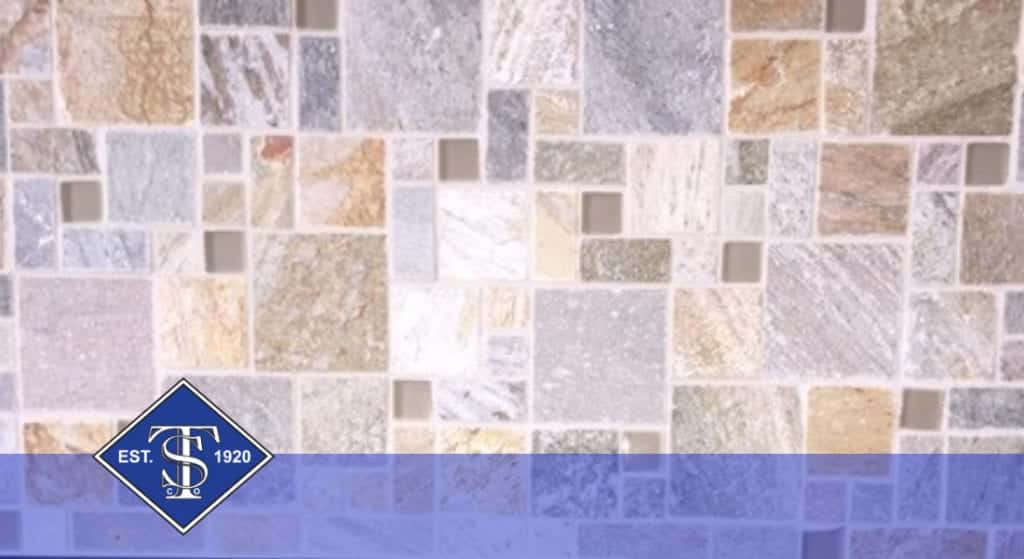
How about the famous 1930s! The fourth decade of the 20th century brought art deco to the forefront with charm and style. Bold inspired colors like pink, burgundy and lavender on one end of the spectrum, with art tiles that were often square, irregular and set with a wider grout line on the other. Can you picture kitchen tile like that?
Looking for 1930s style tile? Visit one of our 6 NJ locations:
Standard Tile In Jersey City NJ
Creating a new genre
In the 1930s, 3-D tiles hit the market, featuring rolls, ridges and wave patterns. You could easily find tiles that had goldfish or some introduction to Spanish-style design. White also continued to be a staple for many during the 1930s with subway, hexagon or penny round tiles in full display. This proves that design never goes away, it just lays in wait for the next generation to catch on.
Here are some popular tile styles in the 1920s and carried over into the 1930s:
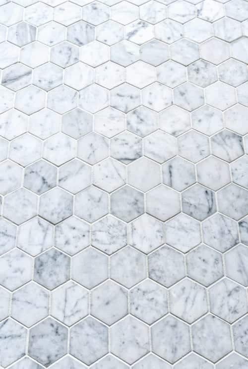
Hexagon
White hexagon tiles in 1” were immensely popular because you could add border patterns and different color designs within the setting.

Penny Round
Penny round tiles created unique looks and came in ¾” and 1” sizes. The uniqueness came from the color of the grout being used to add flair and style.
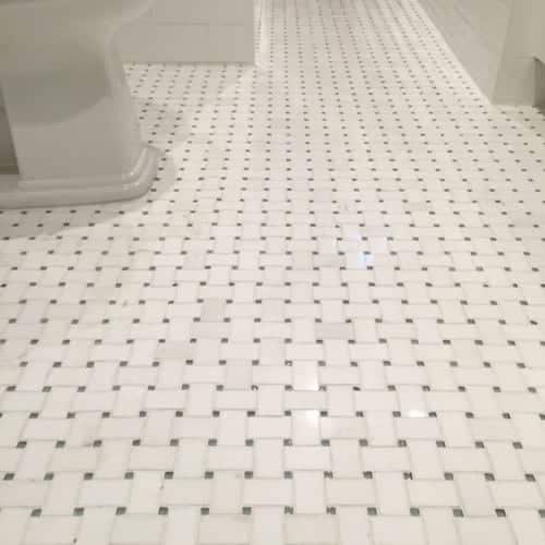
Basket Weave
These tiles are put together to create an illusion of being weaved together and was a very popular option in black and white. Just like the other types of tile, they came in 12” x 12” sheets. Although in high demand, they were more difficult to install because of the preciseness needed to get the pattern right.

Square
Square mosaic tile was a hit during this era as they allowed designers to create borders like winding belts, Greek keys, family names and other unique creations within the flooring to add dimension and a different atmosphere from room to room.
Pinwheel
This trend was popular in the 1920s and 1930s due to its simple and fun design. Most of the time, the pattern went with the white and black motif, but in some cases, designers used blue as a replacement color.
Smaller tiles helped spaces feel as if they were much bigger than they actually were. It’s a huge contrast to the trend of having big spaces that encompass everything without being compartmentalized. The 1930s was an era that ushered in a war and the Great Depression. Even with all the negative things taking place, there’s always a place and time for beautiful design.
That’s one of the reasons we love what we do. From humble beginnings in Brooklyn to a New Jersey expansion in the 1950’s, we’ve set the standard in ceramic tile distribution. Family owned and operated tile stores that’s stood the test of time for over five generations, serving our customers with new designs and the hottest trends.
Takeaways
- The 1930s ushered in Art Deco design
- Small formats were used to make spaces look larger
- White was still a staple, carried over from the 1920s
- Hexagon, penny round, basket weave and pinwheel patterns were popular
There’s something to be said about historic design, and the 1930s doesn’t disappoint. Standard Tile is celebrating our 100th year anniversary this year – we understand what it means to offer excellence for decades in the New York and New Jersey areas. We’re ready to help your design dreams come true! Give us a call or visit one of our stores today.