
How to Choose the Right Ceramic Tile Colors for Your Space
Share
The colors we surround ourselves with profoundly impact our mood, energy levels, and overall well-being. This is especially true in interior design, where the chosen palette can transform a space.
When it comes to ceramic tile, understanding color psychology is a powerful tool to ensure your ceramic tile colors not only look beautiful but also evoke the desired emotions and atmosphere in your home.
The Power of Color in Interior Design
Color is more than just an aesthetic choice; it’s a language that speaks to our subconscious. Different colors can:
- Influence Mood: Evoke feelings of calm, energy, warmth, or sophistication.
- Perceived Space: Make a room feel larger or smaller.
- Highlight Features: Draw attention to architectural details or décor elements.
- Reflect Light: Impact the brightness and airiness of a room.
Ceramic Tile Colors and Their Psychological Impact
- Whites and Off-Whites:
- Psychology: Purity, cleanliness, spaciousness, simplicity, freshness.
- Impact on Space: Makes rooms feel larger, brighter, and more open. Creates a clean, minimalist backdrop.
- Ideal for: Bathrooms (for a pristine look), kitchens (for a crisp, modern feel), small spaces to maximize light.
- Grays:
- Psychology: Sophistication, balance, neutrality, calmness, modernity.
- Impact on Space: Provides a chic and contemporary foundation. Can make spaces feel cool and serene. Lighter grays feel airy, darker grays add depth.
- Ideal for: Modern kitchens, contemporary bathrooms, living areas for a sleek, versatile base.
- Beiges and Creams:
- Psychology: Warmth, comfort, naturalness, stability, timelessness.
- Impact on Space: Creates a cozy and inviting atmosphere. Can make rooms feel larger while still providing warmth. Highly versatile.
- Ideal for: Living rooms, traditional kitchens, master bedrooms, and any space where warmth and coziness are desired.
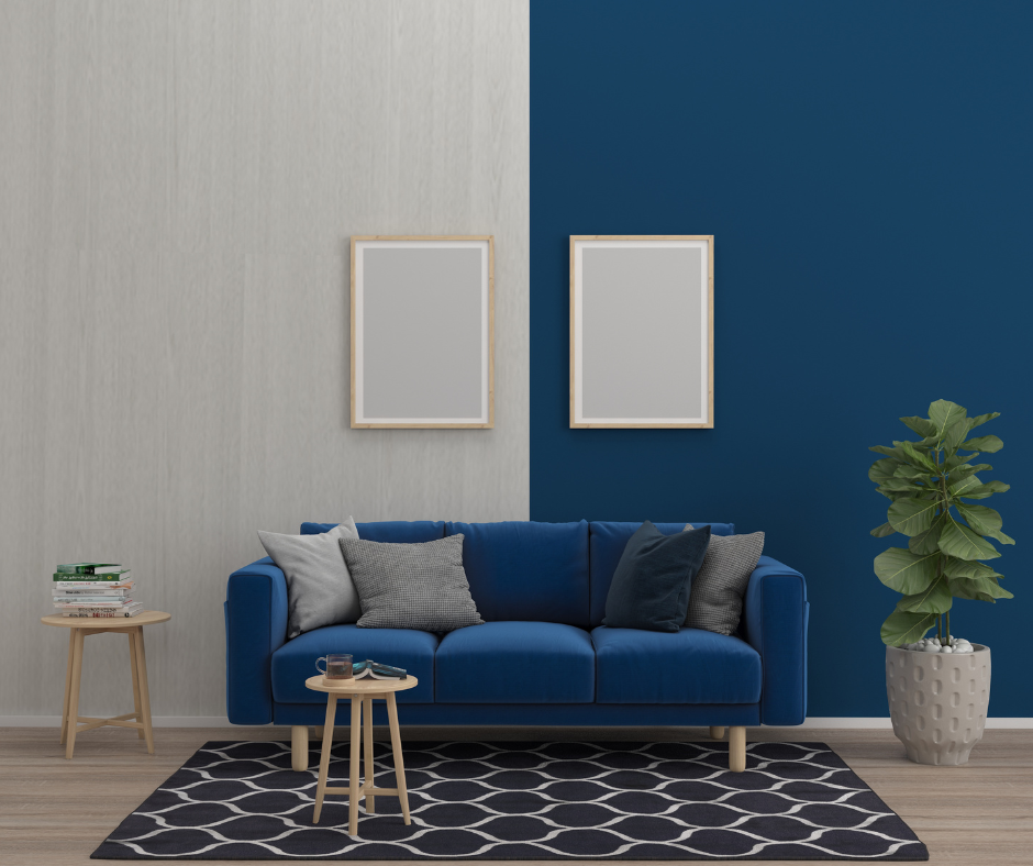
- Blues:
- Psychology: Calmness, tranquility, stability, freshness, serenity.
- Impact on Space: Evokes a sense of peace and openness. Lighter blues feel airy, darker blues add depth and sophistication.
- Ideal for: Bathrooms (for a spa-like feel), bedrooms (for relaxation), laundry rooms for a clean look.
- Greens:
- Psychology: Nature, harmony, growth, freshness, tranquility, balance.
- Impact on Space: Brings the outdoors in, creating a refreshing and balanced environment. Muted greens are particularly popular for serenity.
- Ideal for: Bathrooms, kitchens, mudrooms, or any space where a connection to nature is desired.
- Browns and Earth Tones (e.g., Terracotta):
- Psychology: Grounding, warmth, stability, comfort, naturalness.
- Impact on Space: Creates a cozy, rustic, or natural atmosphere. Can make large spaces feel more intimate.
- Ideal for: Farmhouse kitchens, rustic bathrooms, entryways, or spaces with a strong connection to natural elements.
- Blacks:
- Psychology: Elegance, sophistication, drama, power, modernity.
- Impact on Space: Adds a bold, dramatic statement. Can make a large room feel more intimate or highlight a feature.
- Ideal for: Modern bathrooms (as accents or feature walls), sleek kitchens, or creating high contrast. Often best used in conjunction with lighter colors to avoid making a space feel too dark.
Choosing the Right Ceramic Tile Colors for Your Space
Consider the Room's Function:
High-Energy Spaces (Kitchen): You might lean towards brighter whites, or warm beiges, or even bold accents if it suits your personality.
Relaxing Spaces (Bathroom, Bedroom): Calming blues, greens, or soft neutrals are often preferred.
Evaluate Natural Lighting:
North-Facing Rooms: Tend to have cooler, indirect light. Warm tile colors (beiges, creams, warmer grays) can balance this.
South-Facing Rooms: Receive abundant warm light. Cool tile colors (blues, cool grays) can provide balance without making the room too warm.
Harmonize with Existing Elements:
Look at existing cabinetry, countertops, furniture, and wall paint. Do you want your tile to blend seamlessly, provide a subtle contrast, or make a bold statement?
Use sample tiles to see how they interact with your room's specific lighting and existing elements.
Think Long-Term:
While trends are fun, classic neutrals often provide timeless appeal. If you love a bolder color, consider using it as an accent tile or on a smaller surface.
Find the Color that Speaks to You with Standard Tile in New Jersey
Understanding color psychology is a powerful guide when choosing your ceramic tile colors. By intentionally selecting hues that align with the function of your space, the natural lighting, and your desired mood, you can create an environment that truly resonates with you and your family.
Call or Visit Standard Tile in East Hanover, Edison, Jersey City, Succasunna, Totowa, or Watchung. We are an industry-leading tile retailer with tile stores across New Jersey. We’ve won three Best Of Houzz awards for service and design, and our tile selections will take the interior of your home to the next level. View our galleries here, and visit us at one of our showrooms today for kitchen tile, bathroom tile, porcelain tiles, and ceramic tiles for all of your home’s living areas.